MOHAWK
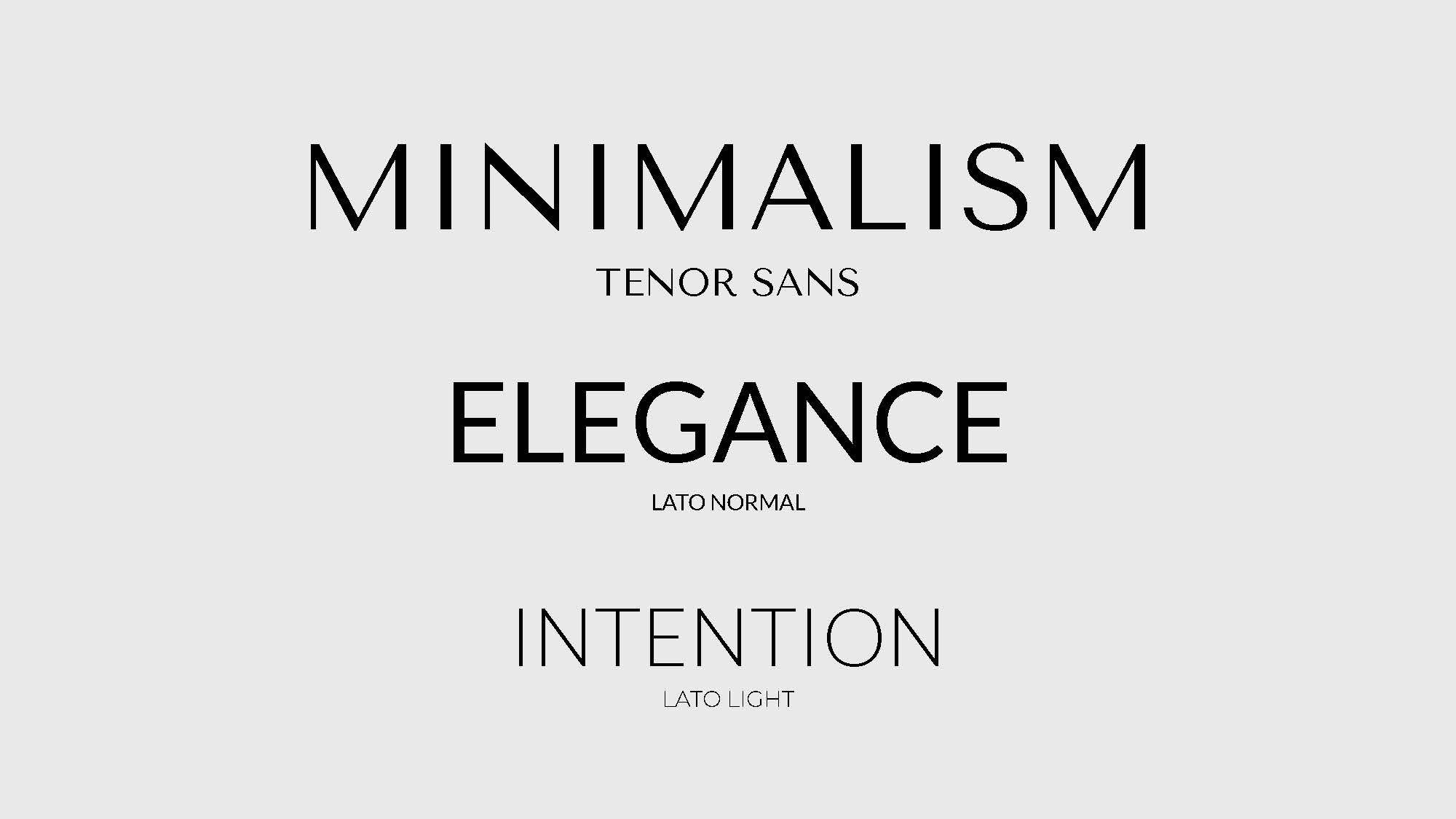
Redesigned the Mohawk brand identity with a focus on minimalism, elegance, and intention. The project reimagines the brand through a luxury lens, creating a refined system that transforms each brand touchpoint into a thoughtful and elevated experience. Mohawk 브랜드 아이덴티티를 미니멀하고 우아한 방향으로 새롭게 디자인했습니다. 브랜드를 럭셔리한 관점에서 새롭게 해석하고, 로고와 비주얼 요소들이 더 정제되고 의도적으로 보이도록 시스템을 구성했습니다. 이를 통해 브랜드의 각 접점이 단순한 시각 요소를 넘어, 더 섬세하고 완성도 있는 경험으로 느껴지도록 했습니다.
SERVICES
Brand Identity Design
Logo Redesign
Merchandise Design
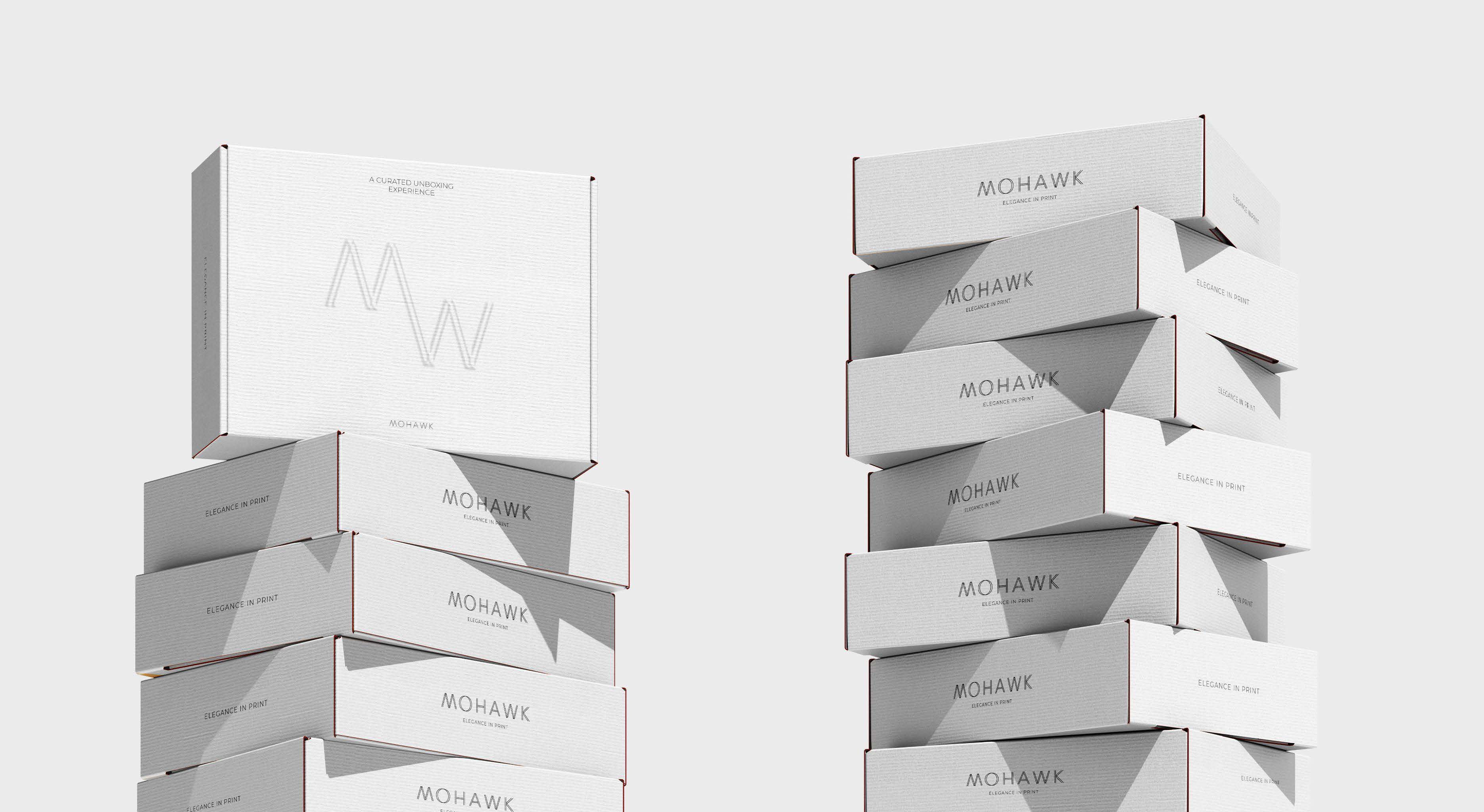
Developed a new visual identity for Mohawk that highlights the idea that luxury begins before the product is even revealed. Guided by the concept, “Luxury isn’t just what’s inside — our minimalist packaging transforms every unboxing into an experience, proving true elegance begins at first glance,” the redesign focuses on restraint, clarity, and refined details.
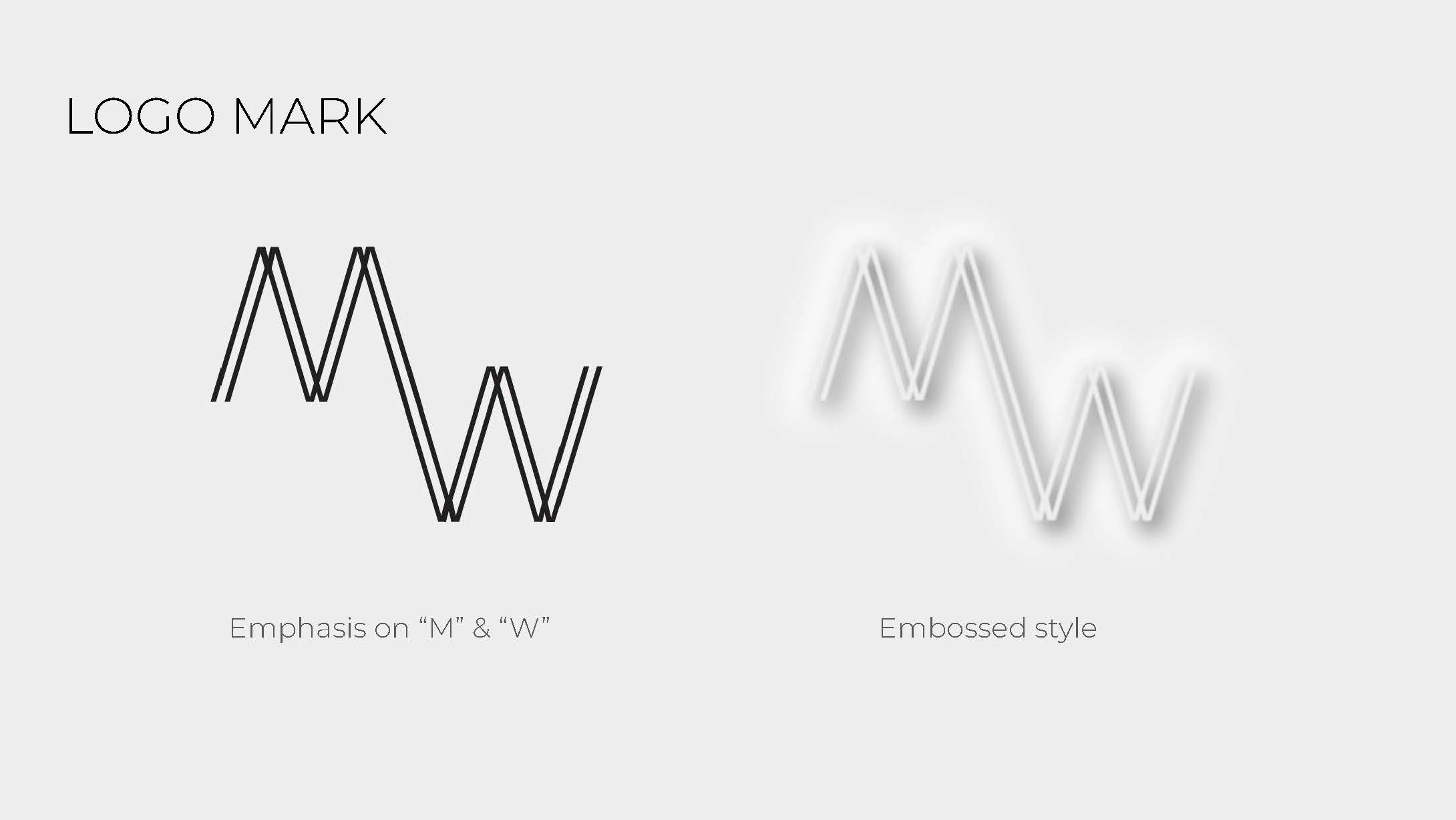
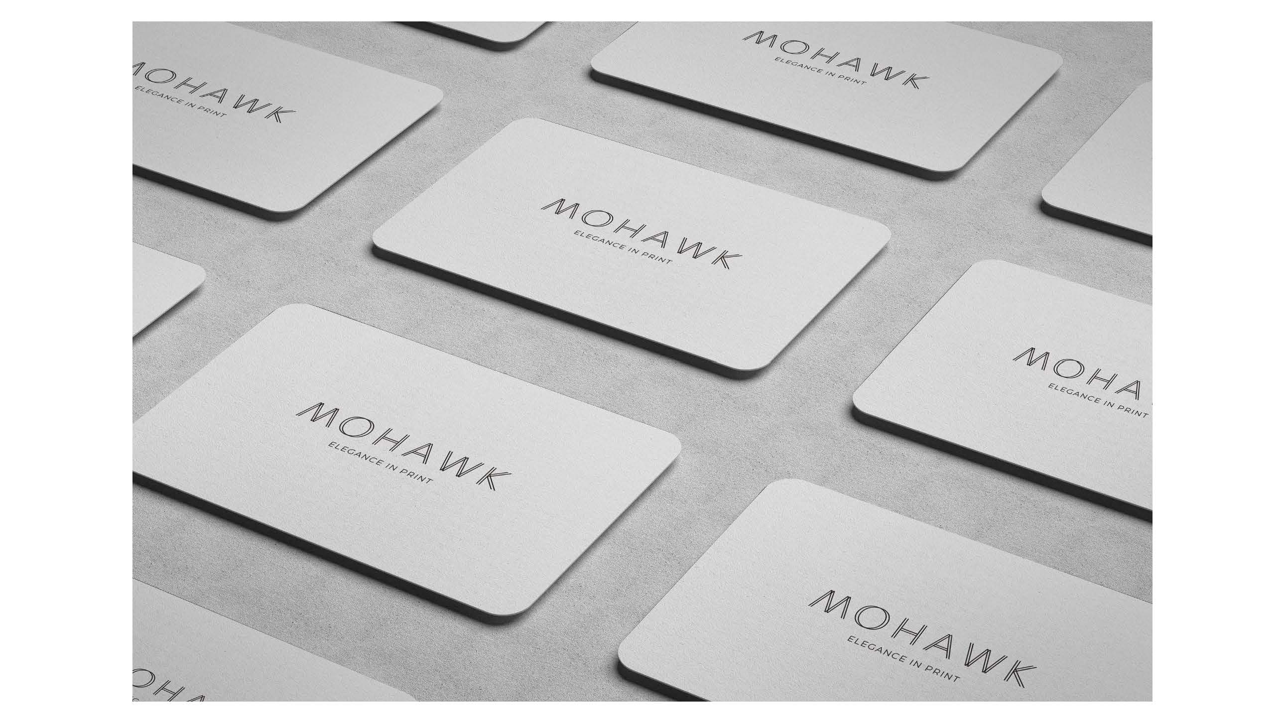
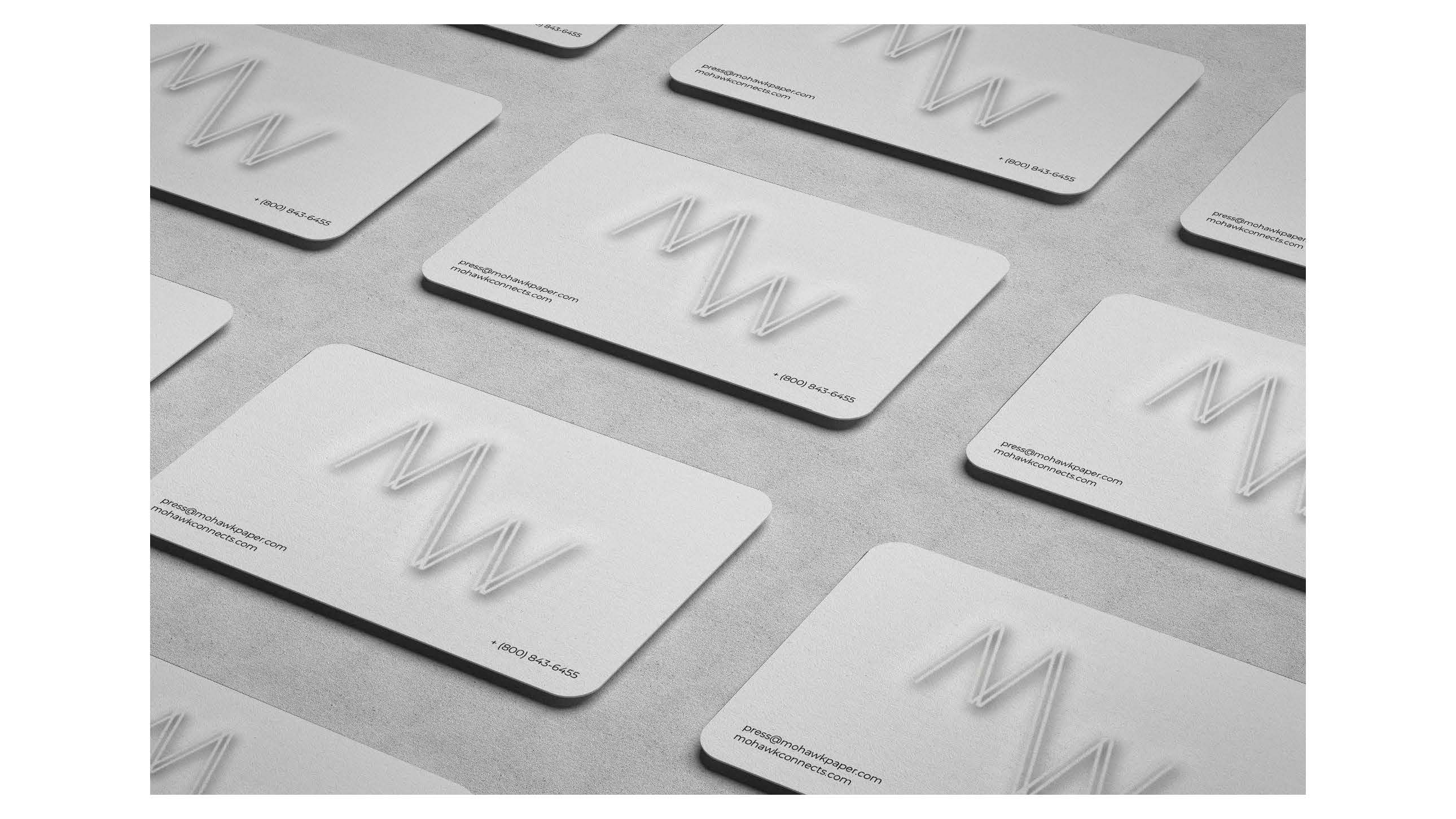
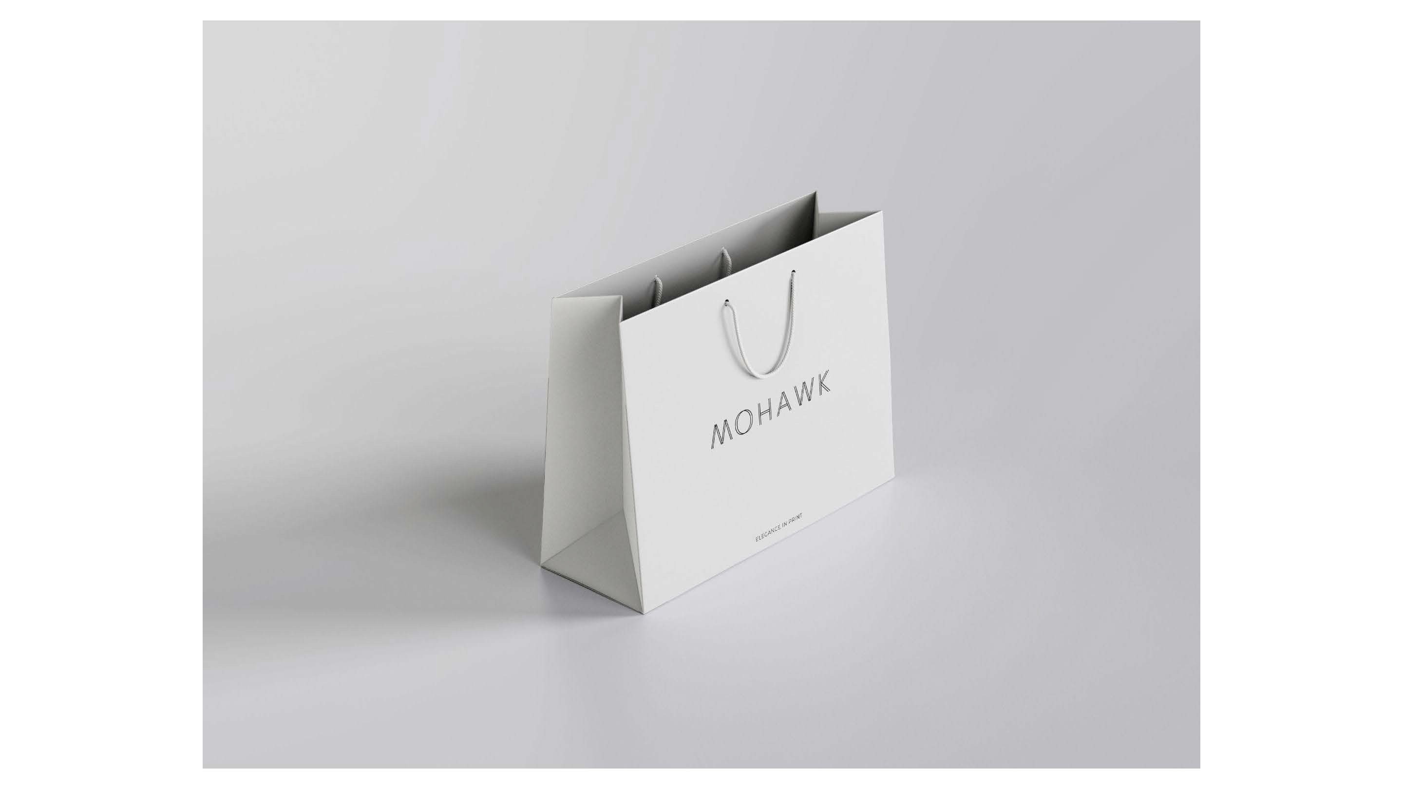
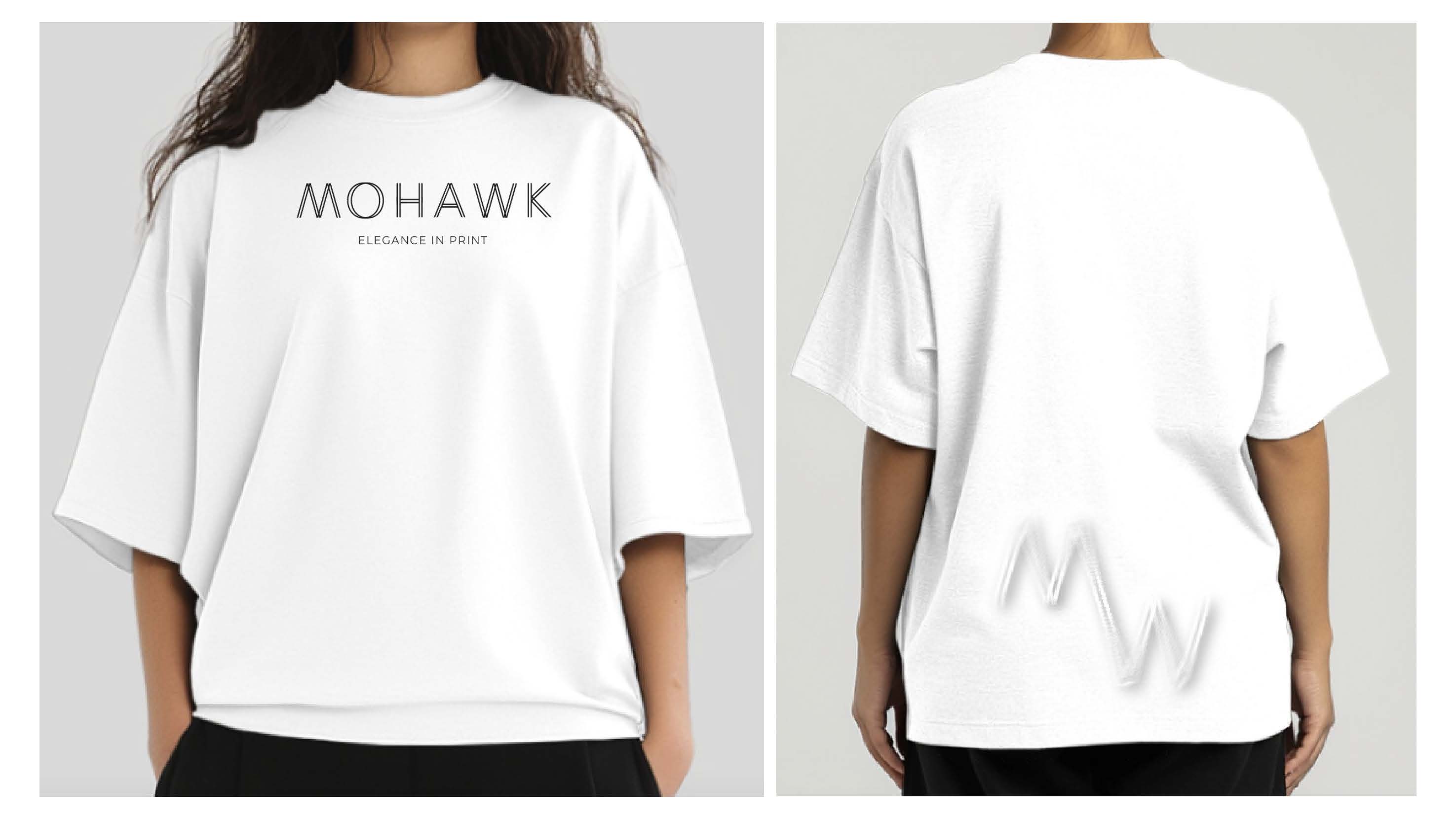
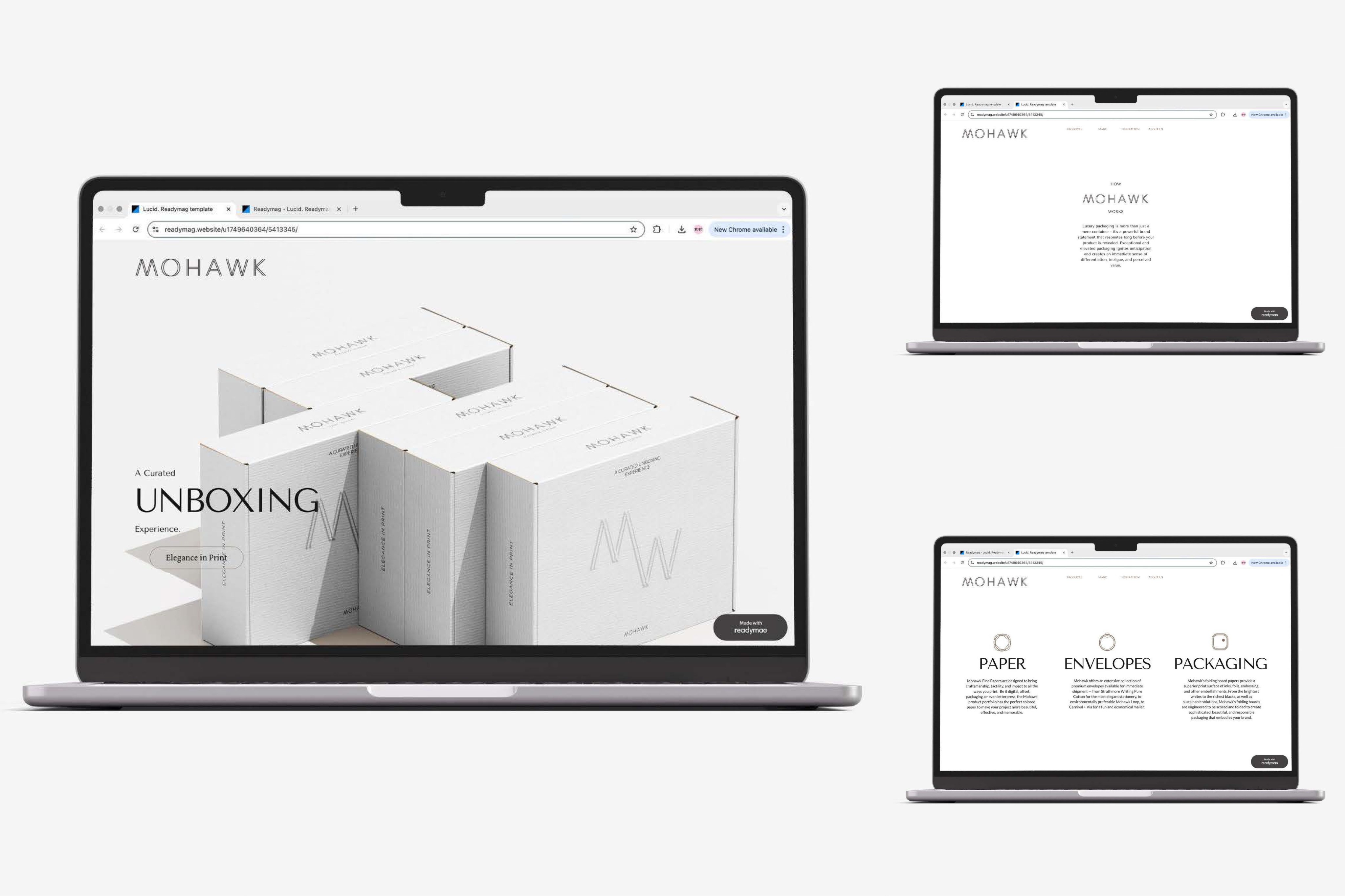
The project includes a redesigned logo, business cards, packaging, T-shirt, and website. Each element was created to feel cohesive, polished, and intentional, using minimal design choices to communicate sophistication. Through clean layouts, elegant branding, and considered packaging, the new Mohawk identity creates a stronger first impression and turns the unboxing experience into a memorable part of the brand. “진정한 럭셔리는 제품 안에 담긴 것만으로 완성되는 것이 아니라, 첫인상에서부터 시작된다. 미니멀한 패키지는 언박싱의 순간을 하나의 경험으로 바꾼다.” 라는 콘셉트를 바탕으로, 절제된 디자인과 명확한 구성, 섬세한 디테일을 중심으로 브랜드를 새롭게 해석했습니다. 이 프로젝트는 로고, 명함, 패키지, 티셔츠, 웹사이트 디자인으로 구성되어 있으며, 각 요소가 하나의 브랜드 경험처럼 자연스럽게 연결되도록 설계했습니다. 미니멀한 레이아웃과 정제된 브랜딩, 신중하게 구성된 패키지 디자인을 통해 Mohawk의 첫인상을 더욱 강하게 만들고, 언박싱 순간까지 브랜드 경험의 일부로 확장했습니다.